Lessons in Grafana - Part One: A Vision
2026-02-23
A few months ago a friend showed me their data collection in Grafana, a visualization tool. I was deeply impressed! They seemed to collect everything that their self-hosted services were producing and had wonderful displays for them. This is something I had always wanted from a distance, but had never managed to start on. As it turned out, this is because I lacked a motivating use case. Recently, I found one.
This series of blog posts is going to cover my journey through data collection. I will not be telling it in order. Instead, I will try to build up from the simplest task for the lay-person, adding complexity until we reach my works-in-progress. This will come in seven parts posted at one week intervals. As there are many tutorials on how to set up Grafana initially, I will not be including those details here except when discussing future plans. More posts might get added later on as the project develops.
1) A Vision (you are here)
2) Litter Logs
4) Noticing Notes
5) Graphing Goatcounter
6) Bridging Gadgets? Biometrics Galore!
7) Plotting Prospective Plans
As those who follow me know, I’m currently between jobs. My previous position was grant-funded, and the grants ran dry. This means that I have been sending out applications daily, and I needed a way to track them more closely. Before this project, I was doing this in a very ad-hoc way that wasn’t terribly effective. This entry will examine this use case and lay the foundations for future entries.
A Quick Review
In this series we are going to be looking in depth at data collection and visualization. This means we need to have some fundamentals on what that looks like.
In general, data is formatted as tables. Think of spreadsheets, if that helps, as this entry literally is about spreadsheets. Column names are used to determine what data we select, and we can put conditions on what data gets included. You can, for instance, say “I want all workout entries between these two dates”.
This information gets fed into Grafana, which has a number of visualization tools. The ones we will be using most prominently in this series are pie charts, time series, state timelines, and a single Sankey diagram. If you are comfortable with these, feel free to skip ahead.
Pie Charts
A pie chart is what it says on the tin: it looks like a pie, with different slices being labeled to correspond to different entities. A typical pie chart will look like one of the following:
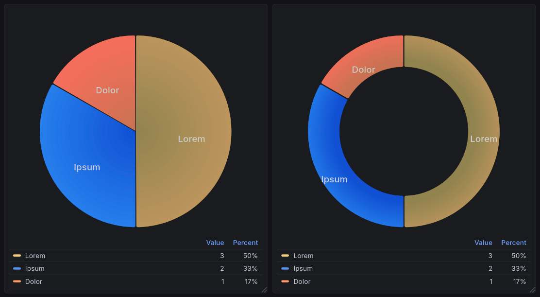
A sample pie chart visualization generated by Grafana’s plugin pie chart plugin [graa]. This shows two charts: a pie chart of sample data shown below, and a donut chart (a variation of the pie chart) of the same data.
Pie chart data is structured in two columns: a name and a value[1]. Such data might look like:
Name |
Units |
|---|---|
Lorem |
3 |
Ipsum |
2 |
Dolor |
1 |
Time Series
A time series shows numeric data over time. You see this kind of visualization a lot in day to day life. When you check the weather for the day, the expected temperature is often represented this way. Stock prices are also represented this way. This means that you will see these quite often in the news.
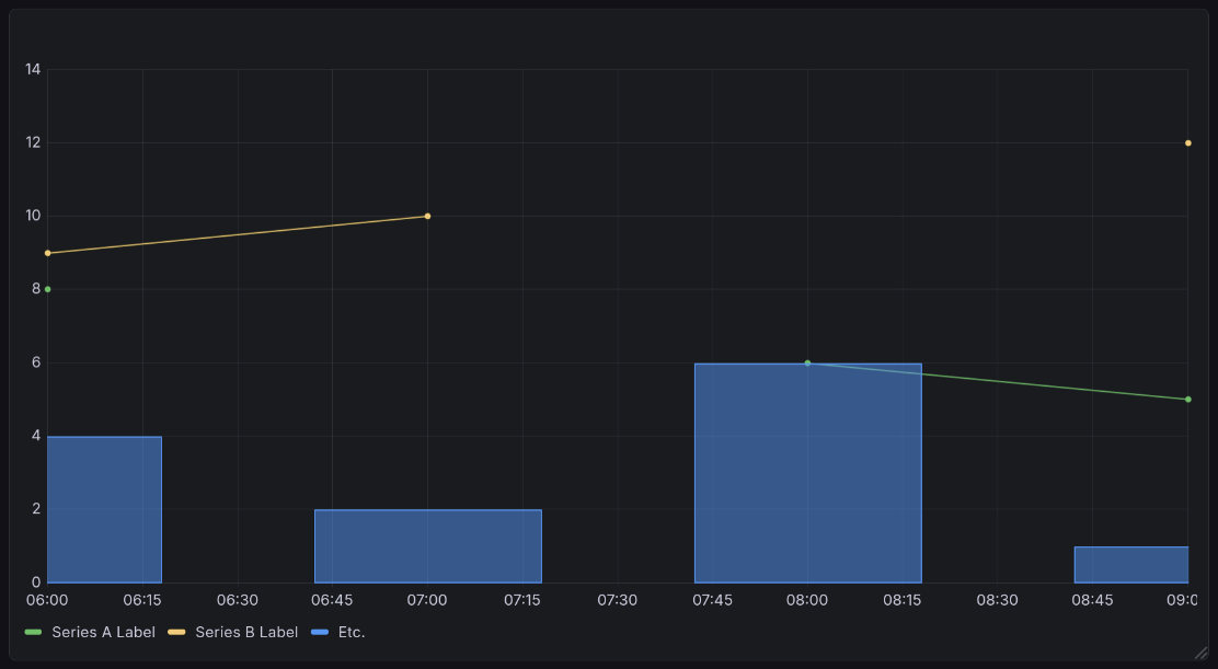
A sample time series visualization generated by Grafana’s time series plugin [grac]. This shows the sample data below, but with an interesting twist: one series is represented as bars, but the rest as lines. This demonstrates the ability of time series to take on multiple representation, using lines, bars, or dots. All are the same chart type, and all can appear in one chart.
Time series data is formatted in many columns. One must be a timestamp. All other columns are series to be graphed, with the column title as their label. Note that all values must be either numeric or empty.
Time |
Series A Label |
Series B Label |
Etc. |
|---|---|---|---|
2026-01-01 12:00:00+00:00 |
8 |
9 |
4 |
2026-01-01 13:00:00+00:00 |
10 |
2 |
|
2026-01-01 14:00:00+00:00 |
6 |
6 |
|
2026-01-01 15:00:00+00:00 |
5 |
12 |
1 |
State Timelines
A state timeline is a bit less common than the above. It shows discrete states over time. You might use this if you, for example, wanted to track whether someone is scheduled to work. Another common use case is to show the states of different machines on your network, for example if they are online, offline, booting, overloaded, etc.
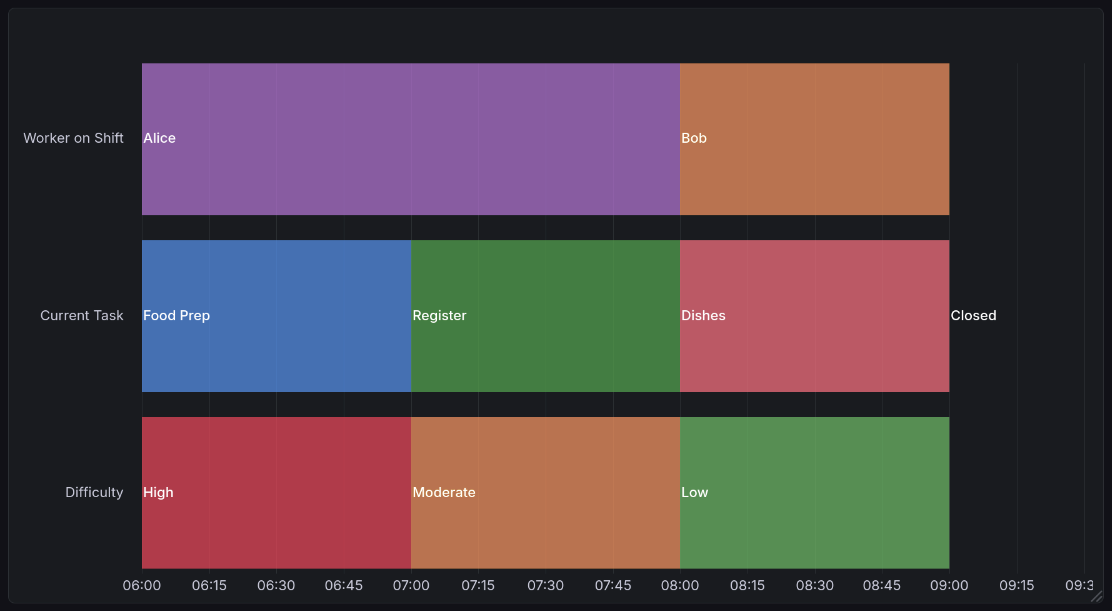
A sample state timeline visualization generated by Grafana’s state timeline plugin [grab]. This shows data from the example below, looking at worker shifts in a hypothetical restaurant. Hovering over it reveals more information, such as the duration and specific state (if an interpreted value is shown rather than raw).
State timeline data is formatted much like time series data[2], but rather than taking on numeric values, you can give states any label you would like. Here is an arbitrary example:
Time |
Worker on Shift |
Current Task |
Difficulty |
|---|---|---|---|
2026-01-01 12:00:00+00:00 |
Alice |
Food Prep |
High |
2026-01-01 13:00:00+00:00 |
Alice |
Register |
Moderate |
2026-01-01 14:00:00+00:00 |
Bob |
Dishes |
Low |
2026-01-01 15:00:00+00:00 |
Closed |
N/A |
Sankey Diagrams
Sankey diagrams are definitely the oddest chart format here. In general, a Sankey diagram is used to represent data flow. A common use case for this is finances: one might want to represent the income of two spouses and how it flows into different expenses.
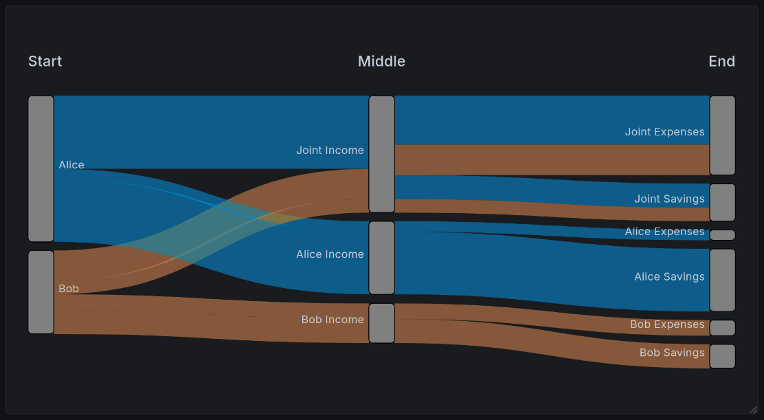
A sample Sankey diagram visualization generated by Grafana’s Sankey plugin [grad]. This shows the example we illustrate below, looking at the flow of a two-income couple.
Sankey data is typically represented in two or more columns. In the version specific to Grafana, these columns represent the entire journey followed by a value. Other Sankey visualizers support you defining a single source and destination, and it will dynamically figure out the overall journey. To illustrate an example, suppose Alice and Bob are married. They each split their income 50/50, Alice makes $70k, and Bob makes $40k. Their finances might look like this:
Start |
Middle |
End |
Count |
|---|---|---|---|
Alice |
Joint Income |
Joint Expenses |
23500 |
Bob |
Joint Income |
Joint Expenses |
14500 |
Alice |
Alice Income |
Alice Expenses |
5000 |
Bob |
Bob Income |
Indv. Expenses |
7500 |
Alice |
Joint Income |
Joint Savings |
11500 |
Bob |
Joint Income |
Joint Savings |
6500 |
Alice |
Alice Income |
Alice Savings |
30000 |
Bob |
Bob Income |
Bob Savings |
11500 |
It’s important to remember that you can use it to visualize any number of steps. Our example here shows three, but it can handle any number of transitions. You will always have one more column than the number of steps.
Implementation Challenges
Before this project, I was tracking job applications in a very ad-hoc way. It wasn’t terribly effective. With the goal of making visualizations and helping to gamify the process, I began working on a tracking dashboard. I had several requirements for this use case:
I want to minimize the friction of adding data. In other words, I should record the minimum information possible, and have as much of it automated as possible.
I want to maximize the number of devices I can add that data from. I should be able to enter this from my phone, laptop, and desktop without worrying about synchronization.
I want to be able to conveniently edit or backdate information. Sometimes things are recorded incorrectly. Whatever tool I am using should allow me to quickly fix such cases.
This leads to the inevitable conclusion of an online spreadsheet. Next, we will talk about the challenges that arise from that data store, as well as alternatives and why they were rejected.
Problems Inherent to Spreadsheets
There are a number of drawbacks inherent to this data format.
Dimensionality
Spreadsheets are inherently two-dimensional. This means that if you ever need to encode more than two dimensions in your data, you have to get very creative (ex: using multiple sheets). This is not a problem that exists in databases, where you can have an arbitrary number of dimensions by using tools like arrays, or easily-accessed secondary tables.
Lack of Query Language
Because the data is entered into a spreadsheet, I have no way to do the sorts of powerful queries possible in a database. When querying a spreadsheet, you have exactly four options:
Which set of sheets to look at
Which sheet within that set to look at
How long the data should be cached for
Whether to apply a time filter to the first column only.
Everything other than that has to be done with Grafana transformations, which have significant limitations when compared to database queries. They are significantly slower, which means you are limited in the number of them that can be reasonably used.
Balancing Ease of Entry with Ease of Processing
In the end, this data is complex enough that I am stuck with two possibilities. I can write an application specific to this task that allows data entry on the fly, or I use a cloud-based spreadsheet. Let’s look at some approaches this application could take, and why I have rejected them.
A Local Spreadsheet
The easiest alternative would be to have a local spreadsheet that tracks it. This would be hosted on my home computer, and possibly synced between other devices such as my laptops. I even have already-existing code that will scan a spreadsheet periodically and dump its contents into a database.
This solution is not ideal, though, because it requires that I be at a computer. While applying for jobs on a mobile device isn’t something I would prefer to do, utilizing this solution would close off that possibility entirely. That’s not acceptable.
Entry in Joplin
Given the constraint above, I could enter this data in Joplin (my note-taking application of choice). There are already easy ways for me to extract CSV (Comma Separated Values) formatted tables from there and dump them to a database. It syncs to mobile devices with their app, meaning I would maintain seamless access.
The problem with this is that CSV is an awful format for humans to work with. It’s wonderful for computers: very simple, easily portable, standardized. But that formatting that makes it easy for computers to parse also means that when working with it as a person it is ugly and cumbersome. As an example, this is what that format looks like for time tracking data:
Project,Task,Start date,Start time,End date,End time,Duration
Transport,Driving,2026-01-17,18:25:46-06:00,2026-01-17,18:59:11-06:00,00:33:25
Transport,Driving,2026-01-17,19:51:22-06:00,2026-01-17,20:10:54-06:00,00:19:32
Career,Job Seeking,2026-01-18,14:00:21-06:00,2026-01-18,14:25:21-06:00,00:25:00
Transport,Driving,2026-01-19,10:39:45-06:00,2026-01-19,11:04:14-06:00,00:24:29
Fun,RPG,2026-01-19,12:11:37-06:00,2026-01-19,15:05:37-06:00,02:54:00
Transport,Driving,2026-01-19,15:19:53-06:00,2026-01-19,15:46:17-06:00,00:26:24
Career,Writing,2026-01-19,16:11:24-06:00,,,
See how hard that would be to edit? And while there are Joplin plugins that make it easier to edit Markdown tables, those plugins do not work for CSV, nor would I expect them to. This solution dramatically increases friction at time of entry.
Extension to my Data Tracking Bot
Lastly, I have an existing application that takes in commands from instant messaging and adds entries to a database. This does not suit this purpose because it doesn’t allow me to view the data. It’s often difficult to tell which particular application a response is intended for. This means it needs to be easy to view the thing you are editing. This is very cumbersome in an instant messaging context for nearly identical reasons to the above.
Unfortunately, this means a cloud-based spreadsheet is my best solution here. It is possible to get the benefits of both worlds by scraping this data to my postgres database, but that method is somewhat inflexible if the data format changes. Since I don’t know that this is final, I haven’t done so yet. In any case, this would not solve the main drawback of a cloud service: I have no control over where the data is, and only limited control for who can read it. For sufficiently private information, storing it plain text in the cloud is a bad security practice. While this is not data that would be devastating to leak, I don’t like having that attack surface in the first place. I try to avoid it whenever possible.
Job Application Data Format
Company |
Position |
ID? |
Applied |
1st Int. |
2nd Int. |
3rd Int. |
Offer |
Rejected |
Ghosted |
|---|---|---|---|---|---|---|---|---|---|
Wikimedia |
Minister of Coffee |
123 |
Jan 2 |
Jan 7 |
Jan 11 |
||||
Mapbox |
GPS Voice |
456 |
Jan 3 |
Jan 17 |
|||||
GitLab |
Amb. to Antarctica |
789 |
Jan 10 |
Each field has a specific purpose, and is put to use either for tracking or for visualizations. Most of these are manually entered, but the Ghosted column is a bit smarter. It’s powered by a formula. If the newest cell leftward of it is more than two weeks old[3], it automatically is marked as ghosted. That value is tunable, but 2 weeks is a useful value for most purposes.
If you're curious, click here for the formula
Good to know you’re reading these! There will be quite a few of them in this series.
=MAP(
    D2:D, E2:E, F2:F, G2:G, H2:H, I2:I,
    LAMBDA(
        D, E, F, G, H, I,
        IF(
            AND(NOT(H), NOT(I), NOT(NOT(D)), MAX(D, E, F, G) + $M$1 < NOW()),
            MAX(D, E, F, G) + $M$1,
            ""
)))
This information is then processed into several views for visualization purposes, which we’ll show below.
The raw data for these charts can be seen by clicking here.
Company |
Position |
ID? |
Applied |
1st Round |
2nd Round |
3rd Round |
Offer |
Rejected |
Ghosted |
|---|---|---|---|---|---|---|---|---|---|
Grafana’s Cousin Greg |
Staff Backend Engineer – Loki Ingest & Vibes |
GREG-LOKI-001 |
1/6/2026 |
1/7/2026 |
|||||
Grafana’s Cousin Greg |
Senior Backend Engineer – Observability but Chill |
GREG-OBS-002 |
1/6/2026 |
1/20/2026 |
|||||
Wikimedia-ish Foundation |
Software Engineer – Button Alignment Team |
WIKI-BTN-404 |
1/6/2026 |
||||||
Mapbox But Larger |
Software Engineer II – Maps of Maps |
MAP-MAP-001 |
1/6/2026 |
1/12/2026 |
|||||
Grafana’s Cousin Greg |
Principal Engineer – Metrics About Metrics |
GREG-META-777 |
1/7/2026 |
1/21/2026 |
|||||
Wikimedia-ish Foundation |
Software Engineer – MediaWiki Interfaces (Again) |
WIKI-UI-405 |
1/7/2026 |
||||||
Mapbox But Larger |
Software Engineer II – Search, But Faster |
MAP-SRCH-002 |
1/7/2026 |
1/12/2026 |
|||||
Dropbox (Cardboard Edition) |
Backend Software Engineer – Box Logistics |
BOX-ENG-123 |
1/7/2026 |
||||||
Vercel (Edge of the Edge) |
Software Engineer – Edge Compute (Edge of the Edge) |
EDGE-EDGE-01 |
1/7/2026 |
||||||
Wikimedia-ish Foundation |
Software Engineer – MediaWiki Interfaces (Please Notice Me) |
WIKI-UI-406 |
1/8/2026 |
1/12/2026 |
|||||
Mapbox But Larger |
Software Engineer II – API (Same Job, New Req) |
MAP-API-003 |
1/8/2026 |
||||||
Figma.fig |
Software Engineer – Distributed Rectangles |
FIG-RECT-01 |
1/8/2026 |
||||||
Netflix 2: Direct-to-Cables |
Distributed Systems Engineer – Buffering Prevention |
VHS-BUF-198 |
1/8/2026 |
||||||
Dropbox (Cardboard Edition) |
Product Backend Engineer – Search Platform (Boxes) |
BOX-SRCH-124 |
1/9/2026 |
||||||
Figma.fig |
Software Engineer – Multiplayer Cursors |
FIG-CURSOR-02 |
1/9/2026 |
||||||
Netflix 2: Direct-to-Cables |
Senior Distributed Systems Engineer – Open Connect, Closed Feelings |
VHS-CDN-199 |
1/9/2026 |
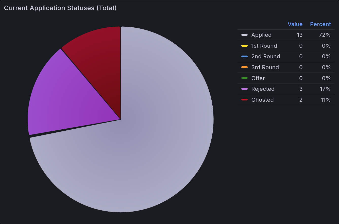
Application Statuses Pie Chart
The most important chart to be able to view at a glance is a pie chart of current application statuses. With a brief look, you can tell what portion are at each stage of the process. Those statuses are the same as above:
Status |
Count |
|---|---|
Applied |
13 |
1st Round |
0 |
2nd Round |
0 |
3rd Round |
0 |
Offer |
0 |
Rejected |
3 |
Ghosted |
2 |
This data is then rendered into a pie chart, as seen below.
Application Statuses Time Series
For a more detailed view of the above, you can also break that down into a time series. This view shows the number of applications that entered that status on a given day. For example, if you have an application to Dropbox that goes through two rounds of interviews before being rejected, you would have an entry corresponding to each of those transitions. First there would be one counted towards Applied, then towards 1st Round, then 2nd, then Rejected. The last column shows the goal of how many you intend to apply to that day (on average).
Date |
Applied |
1st Round |
2nd Round |
3rd Round |
Offer |
Rejected |
Ghosted |
Applied Goal |
|---|---|---|---|---|---|---|---|---|
1/6/2026 |
4 |
0 |
0 |
0 |
0 |
0 |
0 |
1 |
1/7/2026 |
5 |
0 |
0 |
0 |
0 |
1 |
0 |
1 |
1/8/2026 |
4 |
0 |
0 |
0 |
0 |
0 |
0 |
1 |
1/9/2026 |
3 |
0 |
0 |
0 |
0 |
0 |
0 |
1 |
… |
0 |
0 |
0 |
0 |
0 |
0 |
0 |
1 |
1/12/2026 |
0 |
1 |
0 |
0 |
0 |
0 |
2 |
1 |
… |
0 |
0 |
0 |
0 |
0 |
0 |
0 |
1 |
1/20/2026 |
0 |
0 |
0 |
0 |
0 |
0 |
0 |
1 |
1/21/2026 |
0 |
0 |
0 |
0 |
0 |
0 |
0 |
1 |
This gets rendered into the following lovely chart:
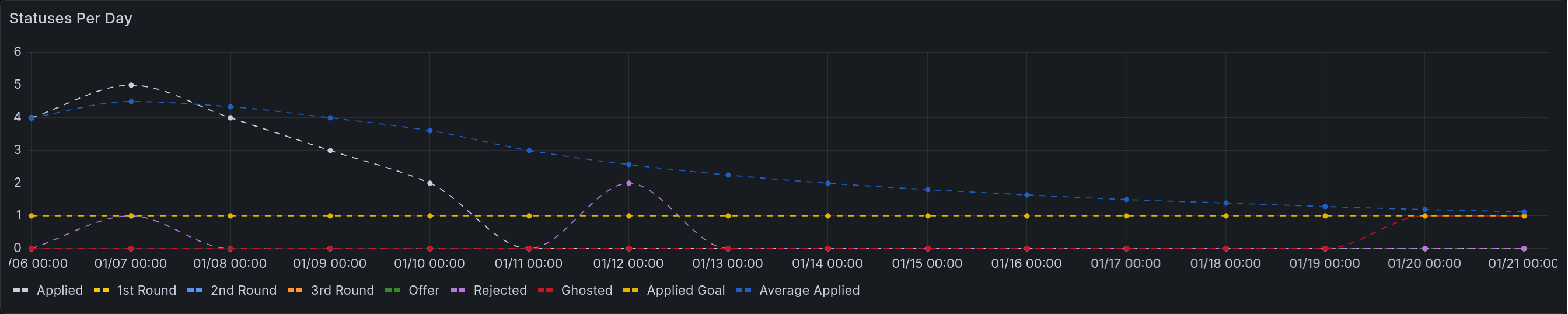
A time series that renders the table above. All of the initial applications appear in the first four days. There is one rejection on the second day, and two more on the 12th of January. The applied goal remains consistent at 1. The average applied steadily diminishes to asymptotically approach it.
A second version of this chart is also available, showing the cumulative status changes. That is to say, it will show the number of applications that have ever been in that status.
A time series that renders the table above, except cumulatively. Each of the points above are rendered instead as permanent increases.
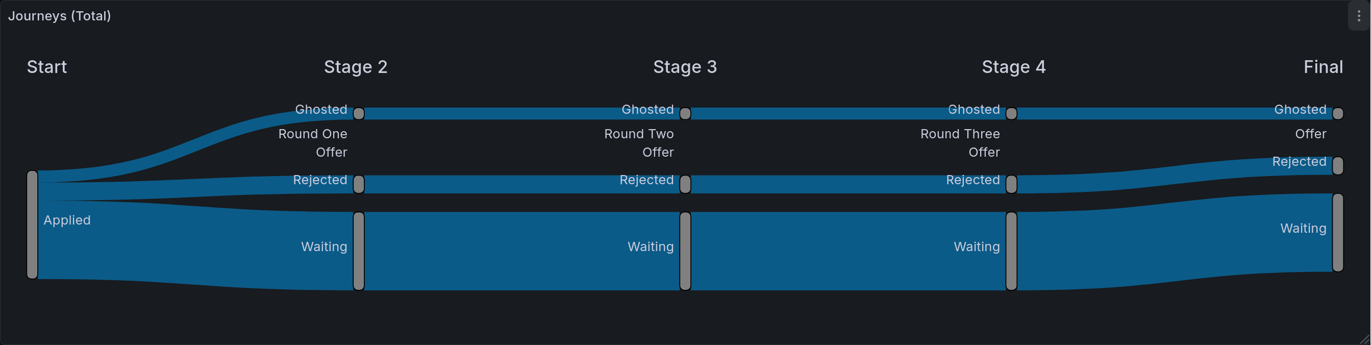
Application Status Journeys
This chart is the most detailed tracker of application statuses. Its goal is to show the journey that all applications took. As a reminder, Sankey diagrams chart out the flow of items through multiple stages. In this case, that means that we are showing the different states that an application can be in, and where they ultimately end up. Given the current hiring market, the most populous entry will likely be that last one of “Applied -> Ghosted”. At the end of this process, this is the chart I am most excited to share. It will demonstrate in a fairly precise way just how much effort goes into job seeking.
Start |
Stage 2 |
Stage 3 |
Stage 4 |
Final |
Count |
|---|---|---|---|---|---|
Applied |
Round One |
Round Two |
Round Three |
Waiting |
0 |
Applied |
Round One |
Round Two |
Round Three |
Offer |
0 |
Applied |
Round One |
Round Two |
Round Three |
Rejected |
0 |
Applied |
Round One |
Round Two |
Round Three |
Ghosted |
0 |
Applied |
Round One |
Round Two |
Waiting |
Waiting |
0 |
Applied |
Round One |
Round Two |
Offer |
Offer |
0 |
Applied |
Round One |
Round Two |
Rejected |
Rejected |
0 |
Applied |
Round One |
Round Two |
Ghosted |
Ghosted |
0 |
Applied |
Round One |
Waiting |
Waiting |
Waiting |
0 |
Applied |
Round One |
Offer |
Offer |
Offer |
0 |
Applied |
Round One |
Rejected |
Rejected |
Rejected |
0 |
Applied |
Round One |
Ghosted |
Ghosted |
Ghosted |
0 |
Applied |
Waiting |
Waiting |
Waiting |
Waiting |
13 |
Applied |
Offer |
Offer |
Offer |
Offer |
0 |
Applied |
Rejected |
Rejected |
Rejected |
Rejected |
3 |
Applied |
Ghosted |
Ghosted |
Ghosted |
Ghosted |
2 |
This table seems pretty long, doesn’t it? Well, that’s because the Sankey plugin for Grafana is non-standard. A more traditional Sankey parser would only have three columns, and therefore be a fair bit more concise. Still, we make due with what we have, and it makes a beautiful flow diagram.
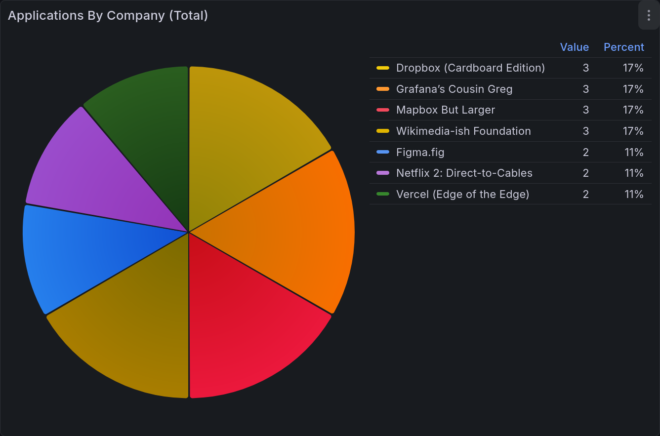
Applications by Company Pie Chart
This last chart is showing the number of applications sent to each company. This is less interesting to me than the others, but it is a good way to keep yourself cautious. You don’t want to over-invest in one place, as that’s taking on a great deal of risk. Having this chart displayed prevents you from putting all your eggs in one basket.
Company |
Applied |
|---|---|
Dropbox (Cardboard Edition) |
3 |
Figma.fig |
2 |
Grafana’s Cousin Greg |
3 |
Mapbox But Larger |
3 |
Netflix 2: Direct-to-Cables |
2 |
Vercel (Edge of the Edge) |
2 |
Wikimedia-ish Foundation |
3 |
This table becomes:
All Together
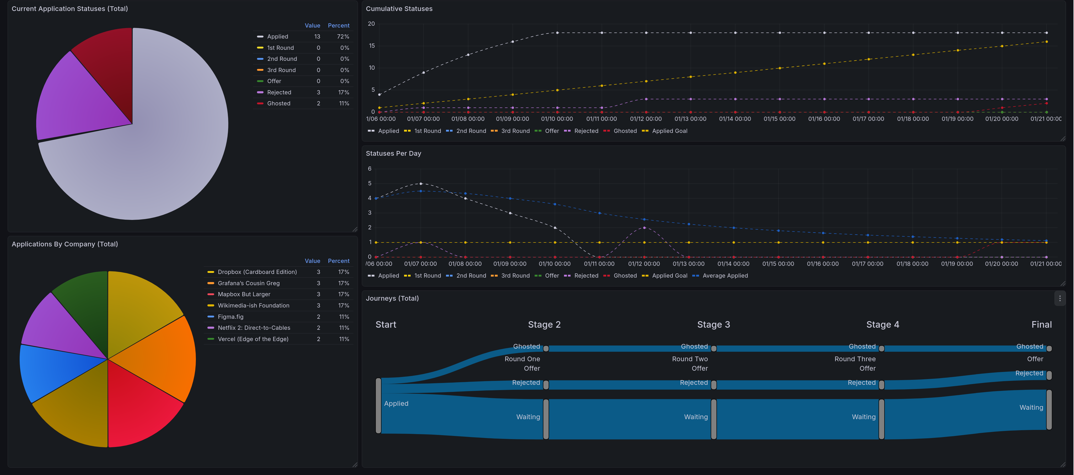
This shows the whole dashboard, giving all five of the panels described here. On the left side are pie charts, first the current application statuses, then below that is applications by company. On the right we have the time series and sankey diagrams. The top shows cumulative status over time. Below that is statuses per day. Below that is the application journey chart.
Future Steps for This Grouping
Better Filtering
Right now, only the time series charts support filtering by time span in any real capacity. In order to fix this, I would likely need to do most of the processing via Grafana transformations rather than processing in the spreadsheet itself. That’s a significant barrier to entry, as transformations are notoriously difficult to debug when they go wrong. Writing spreadsheet formulas is significantly more flexible and allows for more powerful changes. One way to address this (for ex: with the pie charts) would be to add an additional dimension to the tables to encode time. That is a solution that will not work for the Sankey diagram, meaning that one would certainly need to be done via transformations.
I do plan to address this, but as it isn’t a critical need for me yet, it will probably take a good deal of time before I do so.
Time Tracker Integration
In future posts I will be describing a time tracker setup that I have been working on. Right now one of the entries tracks job seeking explicitly. I would very much like to display that, but have not yet gotten around to doing so. This would allow me to extract a number of statistics in addition to total time. Some examples include:
Average time per day
Average time per application
Average time per application at a given company (with some error)
These are all valuable insights that would be nice to have. My time tracker view is not yet produced in a standard way, which I would want to do before tackling this. It is especially difficult, as it would involve mixing data sources together (in this case Google Sheets and PostgresQL).
Main Takeaways
The thing I learned with this dashboard specifically is how to maximize ease of entry. Job seeking is a painful process, and minimizing friction at every step of data entry is very important. That framing forced me to use data sources I would normally shy away from, and as a consequence I implemented it in a very different way to the ones you will see in the next entry: Litter Logs.
Acknowledgments
Thank you to my friends @Ultralee0@linktr.ee and Ruby for doing extensive test reading of this series.
Footnotes
Citations
Grafana pie chart visualization. URL: https://grafana.com/docs/grafana/latest/visualizations/panels-visualizations/visualizations/pie-chart/ (visited on 2026-02-23).
Grafana state timeline visualization. URL: https://grafana.com/docs/grafana/latest/visualizations/panels-visualizations/visualizations/state-timeline/ (visited on 2026-02-23).
Grafana time series visualization. URL: https://grafana.com/docs/grafana/latest/visualizations/panels-visualizations/visualizations/time-series/ (visited on 2026-02-23).
Netsage sankey panel for grafana. URL: https://grafana.com/grafana/plugins/netsage-sankey-panel/ (visited on 2026-02-23).
Cite As
Click here to expand the bibtex entry.
@online{appleton_blog_0006,
  title    = { Lessons in Grafana - Part One: A Vision },
  author   = { Olivia Appleton-Crocker },
  editor   = { Ultralee0 and Ruby },
  language = { English },
  version  = { 1 },
  date     = { 2026-02-23 },
  url      = { https://blog.oliviaappleton.com/posts/0006-lessons-in-grafana-01 }
}
 ,
,
